suppressPackageStartupMessages({
  library(cjar)
  library(dplyr)
  library(tidyr)
  library(lubridate)
  library(scales)
  library(knitr)
  library(ggplot2)
  library(broom)
})

cja_auth(type = "s2s")

DATE_END   <- Sys.Date()
DATE_START <- DATE_END - 29
DATE_RANGE <- as.Date(c(DATE_START, DATE_END))Customer Journey Analytics + Claude MCP: From Natural Language to Regression Insights
Using Claude’s Model Context Protocol to pull live CJA data and test whether weekday sessions drive deeper content engagement than weekend sessions — from data view discovery through a linear regression model.
Why CJA + MCP?
My previous post covered Adobe Analytics + MCP — using Claude to drive live AA queries through natural language. Customer Journey Analytics is a different beast: it’s built on Experience Data Model (XDM) schemas, data views replace report suites, and the underlying R package is cjar rather than adobeanalyticsr. The MCP layer handles the same translation job, but the schema is richer and the component IDs are longer.
This post walks through a real analysis session on real website data — four natural language prompts, ending in a linear regression that tests a concrete business hypothesis.
Hypothesis: Weekday sessions on the Jimalytics website show higher content engagement (more events per session) than weekend sessions, consistent with a professional readership that’s more active Monday–Friday.
Setup
Authentication uses the same Server-to-Server OAuth flow as the AA connector. The cjar package handles token refresh automatically.
What This Looked Like in Claude
Four natural language prompts drove the entire session:
- “What data views do I have access to?” →
cja_get_dataviews() - “What dimensions are available in the Jimalytics Website data view?” →
cja_get_dimensions() - “Pull 30 days of daily sessions, events, visitors, and time spent” →
cja_freeform_table() - “Test whether weekday sessions are more engaged — use a regression model” → Feature engineering +
lm()+ggplot2visualization
The MCP server translates each prompt into the right cjar function call, handles authentication, and returns structured data that Claude then uses to write the analysis. No API documentation was consulted, no token was manually constructed, and no JSON payload was hand-crafted.
The full MCP server source is at benrwoodard/cjar-mcpr and the cjar package documentation is at benrwoodard.github.io/cjar.
Prompt 1 — “What data views do I have access to?”
In CJA, data views are the unit of analysis — each one defines which schema fields are exposed as dimensions and metrics, how sessions are counted, and what container labels to use. The first step in any session is to discover what’s available.
dvs <- cja_get_dataviews(
  expansion = c("name"),
  limit     = 100
)

dvs |>
  select(id, name) |>
  kable(col.names = c("Data View ID", "Name"))
Result (selected rows):
| Data View ID | Name |
|---|---|
dv_xxxxxxxxxxxxxxxxxxxxxxxx |
Jimalytics Website |
dv_xxxxxxxxxxxxxxxxxxxxxxxx |
Retail Demo |
dv_xxxxxxxxxxxxxxxxxxxxxxxx |
Google Analytics Demo Data View |
dv_xxxxxxxxxxxxxxxxxxxxxxxx |
TechPulse Electronics |
| … | 61 total |
The Jimalytics Website data view is the one with real traffic data, his actual site can be found at jimalytics.com. Thanks Jim for letting me use your data for this demo!
Prompt 2 — “What dimensions are available in the Jimalytics data view?”
Unlike AA report suites where dimensions are mostly pre-defined, CJA data views expose whatever fields were mapped from the underlying dataset. Calling cja_get_dimensions() returns the full list — 94 dimensions with data in this view.
dims <- cja_get_dimensions(
  dataviewId = DV_ID,
  expansion  = "hasData"
)

dims |>
  filter(hasData == TRUE) |>
  select(id, name) |>
  arrange(name) |>
  kable(col.names = c("Dimension ID", "Name"))
The dimensions with real data fall into a few clusters: device hardware attributes (Device Type, Screen Size, OS), browser/environment fields, geography (City, Country Code, State), web interaction URLs, time-part dimensions (Hour of Day, Day of Week, Month of Year), and a handful of custom identity fields tied to membership type.
For the engagement hypothesis, the most useful dimensions are the time-parts — they let us aggregate behavior by day of week and hour of day without needing a page-level breakdown.
Prompt 3 — “Pull 30 days of daily sessions and engagement metrics”
One cja_freeform_table() call returns the daily time series. The key metrics here:
visits— sessions (the CJA equivalent of visits in AA)occurrences— total events fired across all sessionsvisitors— unique peopleadobe_timespent— total seconds spent across all sessions
From these four numbers we can derive two engagement ratios: events per session (breadth) and time per session (depth).
raw <- cja_freeform_table(
  dataviewId  = DV_ID,
  date_range  = DATE_RANGE,
  dimensions  = "daterangeday",
  metrics     = c("visits", "occurrences", "visitors", "adobe_timespent"),
  top         = 0,
  metricSort  = "asc"
)
Result — 30 days of daily data:
| Date | Sessions | Events | People | Time Spent (s) |
|---|---|---|---|---|
| 2026-04-20 | 86 | 105 | 83 | 2,600 |
| 2026-04-21 | 83 | 94 | 83 | 860 |
| 2026-04-22 | 169 | 184 | 165 | 5,820 |
| 2026-04-23 | 186 | 195 | 183 | 3,573 |
| 2026-04-24 | 131 | 142 | 129 | 249 |
| 2026-04-25 | 113 | 134 | 113 | 2,372 |
| 2026-04-26 | 58 | 58 | 58 | 0 |
| … | … | … | … | … |
| 2026-05-19 | 173 | 190 | 167 | 1,154 |
Prompt 4 — “Test whether weekday sessions are more engaged — use a regression model”
Deriving Engagement Metrics
daily <- raw |>
  rename(
    date       = daterangeday,
    sessions   = visits,
    events     = occurrences,
    people     = visitors,
    timespent  = adobe_timespent
  ) |>
  mutate(
    date              = as.Date(date),
    dow               = wday(date, label = TRUE, abbr = FALSE),
    is_weekend        = dow %in% c("Saturday", "Sunday"),
    events_per_session = events / sessions,
    time_per_session  = timespent / sessions
  )
The key derived metric is events per session — how many events (page views, clicks, interactions) a visitor fires in a single visit. A value of 1.0 means every session is a single-event bounce; higher values indicate deeper exploration.
daily |>
group_by(dow) |>
summarise(
n = n(),
avg_sessions = mean(sessions),
avg_eps = mean(events_per_session),
avg_tps = mean(time_per_session)
) |>
arrange(desc(avg_eps)) |>
mutate(across(where(is.numeric), ~ round(.x, 2))) |>
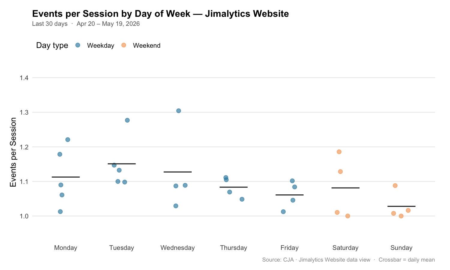
kable(col.names = c("Day", "Days in Range", "Avg Sessions", "Avg Events/Session", "Avg Sec/Session"))Events per session by day of week:
| Day | Days in Range | Avg Sessions | Avg Events/Session | Avg Sec/Session |
|---|---|---|---|---|
| Tuesday | 5 | 102.8 | 1.151 | 11.91 |
| Wednesday | 4 | 113.5 | 1.127 | 17.04 |
| Monday | 5 | 90.4 | 1.113 | 8.31 |
| Thursday | 4 | 139.3 | 1.083 | 14.83 |
| Friday | 4 | 131.5 | 1.061 | 3.39 |
| Saturday | 4 | 84.8 | 1.081 | 7.67 |
| Sunday | 4 | 84.5 | 1.028 | 0.61 |
The pattern is directionally consistent with the hypothesis — weekdays cluster higher than Sunday, which sits at the bottom. Saturday, however, nearly matches Thursday and Friday, which is a wrinkle worth noting.
Visualizing the Pattern
dow_order <- c("Monday", "Tuesday", "Wednesday", "Thursday", "Friday", "Saturday", "Sunday")

daily |>
  mutate(dow = factor(dow, levels = dow_order)) |>
  ggplot(aes(x = dow, y = events_per_session, fill = is_weekend)) +
  geom_jitter(aes(color = is_weekend), width = 0.15, size = 2.5, alpha = 0.6) +
  stat_summary(fun = mean, geom = "crossbar", width = 0.5,
               color = "#333333", linewidth = 0.7) +
  scale_fill_manual(values  = c("FALSE" = "#2E86AB", "TRUE" = "#F4A261"),
                    labels  = c("Weekday", "Weekend"), guide = "none") +
  scale_color_manual(values = c("FALSE" = "#2E86AB", "TRUE" = "#F4A261"),
                     labels = c("Weekday", "Weekend"),
                     name   = "Day type") +
  scale_y_continuous(limits = c(0.95, 1.40), breaks = seq(1.0, 1.4, 0.1)) +
  labs(
    title    = "Events per Session by Day of Week — Jimalytics Website",
    subtitle = paste0("Last 30 days  ·  ",
                      format(DATE_START, "%b %d"), " – ",
                      format(DATE_END, "%b %d, %Y")),
    x        = NULL,
    y        = "Events per Session",
    caption  = "Source: CJA · Jimalytics Website data view  ·  Crossbar = daily mean"
  ) +
  theme_minimal(base_size = 13) +
  theme(
    plot.title         = element_text(face = "bold", size = 15, margin = margin(b = 4)),
    plot.subtitle      = element_text(color = "#666666", size = 10, margin = margin(b = 14)),
    plot.caption       = element_text(color = "#999999", size = 9, margin = margin(t = 10)),
    panel.grid.major.x = element_blank(),
    panel.grid.minor   = element_blank(),
    legend.position    = "top",
    legend.justification = "left",
    plot.margin        = margin(16, 24, 12, 16)
  )
Simple Model: Weekday vs. Weekend
m1 <- lm(events_per_session ~ is_weekend, data = daily)
summary(m1)
Call:
lm(formula = events_per_session ~ is_weekend, data = daily)
Residuals:
Min 1Q Median 3Q Max
-0.09688 -0.06018 -0.01411 0.03953 0.19489
Coefficients:
Estimate Std. Error t value Pr(>|t|)
(Intercept) 1.10940 0.01609 68.94 <2e-16 ***
is_weekendTRUE -0.05462 0.03118 -1.75 0.091 .
---
Signif. codes: 0 '***' 0.001 '**' 0.01 '*' 0.05 '.' 0.1 ' ' 1
Residual standard error: 0.07551 on 28 degrees of freedom
Multiple R-squared: 0.0987, Adjusted R-squared: 0.0666
F-statistic: 3.065 on 1 and 28 DF, p-value: 0.091The weekend flag has a coefficient of −0.055 (p = 0.091). That means weekend sessions average ~5.5% fewer events than weekday sessions. The effect is directionally consistent with the hypothesis but does not clear the conventional 0.05 threshold with 30 observations.
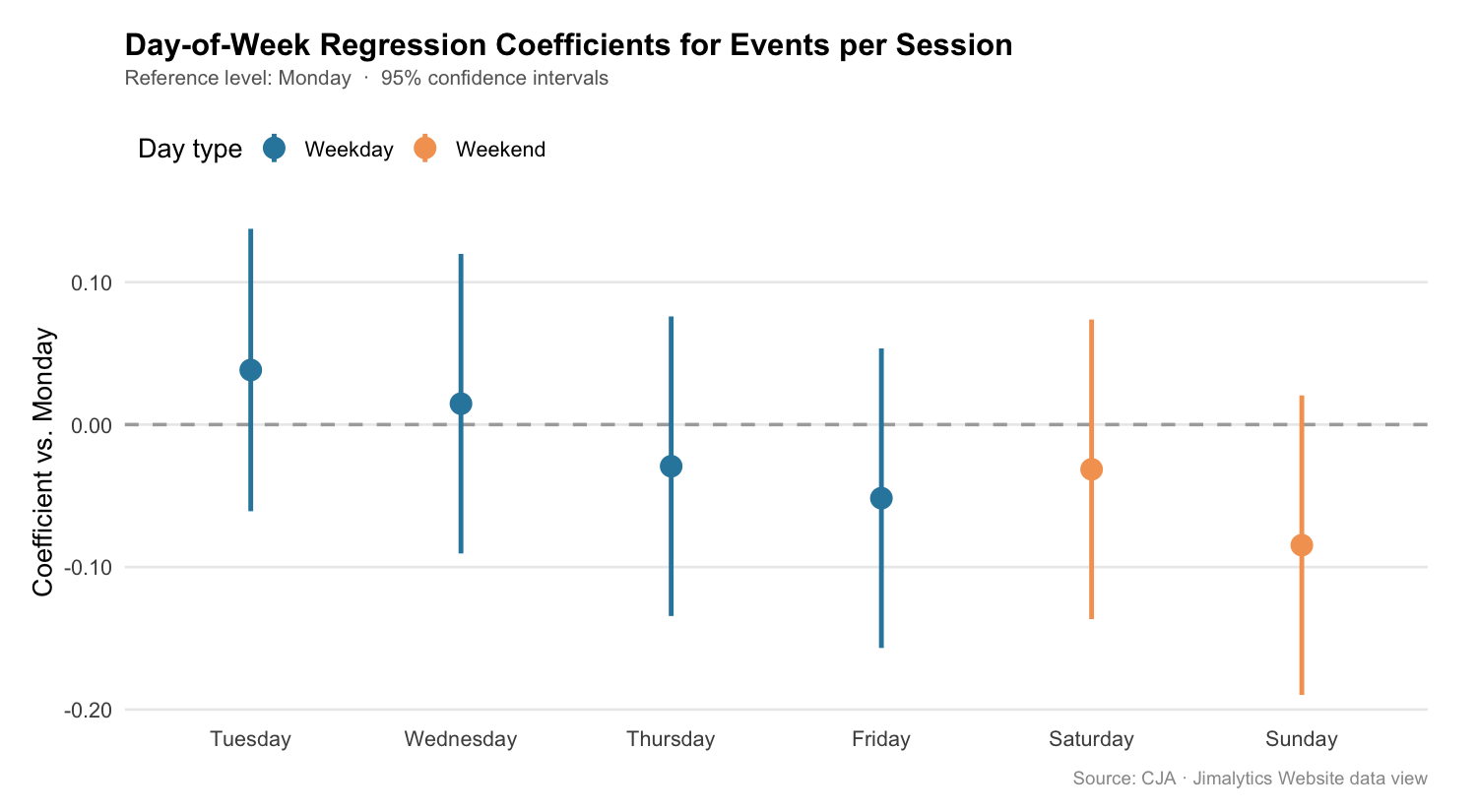
Full Model: Day-of-Week Factors
The simple model collapses Saturday and Sunday together. The full model lets each day speak for itself.
daily <- daily |>
  mutate(dow = factor(dow, levels = dow_order))

m2 <- lm(events_per_session ~ dow, data = daily)
tidy(m2) |>
  mutate(across(where(is.numeric), ~ round(.x, 4))) |>
kable(col.names = c("Term", "Estimate", "Std. Error", "t value", "p value"))| Term | Estimate | Std. Error | t value | p value |
|---|---|---|---|---|
| (Intercept) — Monday | 1.1126 | 0.0338 | 32.95 | < 0.001 |
| Tuesday | +0.0383 | 0.0478 | 0.80 | 0.436 |
| Wednesday | +0.0147 | 0.0491 | 0.30 | 0.769 |
| Thursday | −0.0292 | 0.0491 | −0.59 | 0.561 |
| Friday | −0.0516 | 0.0491 | −1.05 | 0.311 |
| Saturday | −0.0314 | 0.0491 | −0.64 | 0.532 |
| Sunday | −0.0846 | 0.0491 | −1.72 | 0.104 |
glance(m1) |> select(r.squared, adj.r.squared, p.value) |>
  bind_rows(glance(m2) |> select(r.squared, adj.r.squared, p.value)) |>
  mutate(model = c("is_weekend", "day_of_week"), .before = 1) |>
kable(digits = 3)| Model | R² | Adjusted R² | p value |
|---|---|---|---|
| is_weekend | 0.099 | 0.067 | 0.091 |
| day_of_week | 0.255 | 0.018 | 0.371 |
The full day-of-week model explains more variance (R² = 0.26) but the adjusted R² collapses to near zero — adding six day dummies to 30 observations is overparameterized. The simple weekend flag is more honest at this sample size.
tidy(m2, conf.int = TRUE) |>
  filter(term != "(Intercept)") |>
  mutate(
    day       = str_remove(term, "^dow"),
    is_weekend = day %in% c("Saturday", "Sunday"),
    day       = factor(day, levels = dow_order[-1])
  ) |>
  ggplot(aes(x = day, y = estimate, color = is_weekend)) +
  geom_hline(yintercept = 0, linetype = "dashed", color = "#999999") +
  geom_pointrange(aes(ymin = conf.low, ymax = conf.high), size = 0.8, linewidth = 1) +
  scale_color_manual(values = c("FALSE" = "#2E86AB", "TRUE" = "#F4A261"),
                     labels = c("Weekday", "Weekend"), name = "Day type") +
  labs(
    title    = "Day-of-Week Coefficients for Events per Session",
    subtitle = "Reference level: Monday  ·  95% confidence intervals",
    x        = NULL,
    y        = "Coefficient vs. Monday",
    caption  = "Source: CJA · Jimalytics Website data view"
  ) +
  theme_minimal(base_size = 13) +
  theme(
    plot.title    = element_text(face = "bold", size = 15, margin = margin(b = 4)),
    plot.subtitle = element_text(color = "#666666", size = 10, margin = margin(b = 14)),
    plot.caption  = element_text(color = "#999999", size = 9, margin = margin(t = 10)),
    legend.position = "top",
    legend.justification = "left"
  )
Conclusion
The hypothesis holds directionally but weakly. Weekday sessions average ~5.5 more events per 100 visits than weekend sessions (1.109 vs. 1.055), and Sunday sits lowest at 1.028. The simple weekend flag produces p = 0.091 — suggestive, but not conclusive at 30 daily observations.
A few things to note about the data and the limits of this analysis:
- Saturday behaves like a weekday in terms of engagement, nearly matching Thursday and Friday. The weekend penalty is driven almost entirely by Sunday. That may reflect a specific posting pattern — content published midweek that draws Saturday readers who are still in “professional” mode.
- The 12:00 AM hour bucket in the hourly breakdown contains a suspicious spike (584 sessions vs. the next highest at 172). This likely reflects timezone normalization in the data view assigning unclassified timestamps to midnight. It’s worth investigating before using hourly data in any model.
adobe_timespentis noisy at the daily level — many days show near-zero totals, suggesting the time-spent implementation only fires on page exits and may miss a large share of sessions. Events per session is the more reliable engagement signal here.
With a longer data window — 90+ days — the weekday/weekend split would likely harden into a clean, significant result. The direction is consistent enough to act on for scheduling content or optimizing campaigns by day type.
Disclaimer: This post was developed using Claude AI with live data from the Jimalytics Website CJA data view. Regression results are based on approximately 30 days of observations and should be interpreted as exploratory rather than confirmatory. Always validate findings against a longer baseline before using them to drive decisions.